This just in! DNTO's podcast of the entire show can be found here. My segment starts at roughly the twenty-two-minute mark. I heart Rgscarter for posting the link, despite the fact that listening to my own voice makes me cringe. You may feel differently. Or not! But if not, don't tell me about it, okay? I'm fragile.
***
Every year at this time, the shortlist for the Man Booker Prize for fiction comes out, and I find myself floored by my literary ignorance. This year, of the six books on the shortlist, not only have I read none of them, I only recognize… well, one. And I’m not alone. When I talk to other book lovers – people like you and me – we’re all in the same boat. So how are we supposed to jump into all the heated Booker debate?
Well, they say you’re not supposed to judge a book by its cover. Pffft. If you aren’t supposed to judge books by their covers, why do publishers work so hard to design covers solely for that purpose? Otherwise, all book covers would have nothing but plain black lettering on a white background. Which, come to think of it, would be pretty cool in a “In Soviet Russia, book reads YOU” kind of way.
But here in the glamorous western world, we have books with all kinds of fancy covers, and that’s what we’re going to use to review this year’s Booker finalists – and pick the winner!
What you’re about to read is for entertainment purposes only. The writer intends no disrespect toward the writers and their books, nor toward their publishers, the literary community, or the written word at large.
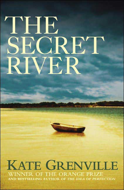 The Secret River
by Kate Grenville
In case you didn’t catch that title, the cover art drives the point home by showing you… a river… a river with an empty boat resting on its shores. So we’ve got secret rivers and empty boats. And is that a grey, lowering sky we see overhead? I’m thinking that what we’ve got here is a story about someone… who’s on a journey… looking for… something. I’d say that in this finely written, carefully nuanced story of love, loss, and redemption, the protagonist searches in vain, but learns something about him- or herself in the process. Everyone loves this kind of tale, yet I don’t see it as the winner. That cover art is just a bit too literal.
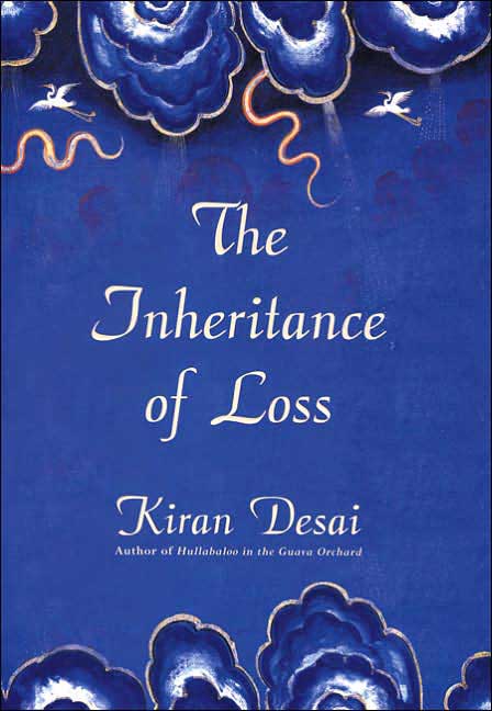 The Inheritance of Loss
by Kiran Desai
I like this cover. It’s a nice shade of blue, with a muted, stylized pattern of clouds on it, and some prettily rendered illustrations of what I take to be cranes – the birds, not the construction machinery – ascending heavenward. It’s got a sort of old-world-meets-new-world Indian quality. That, coupled with the title, gets me thinking “sweeping multi-generational cross-continent family saga.” But to me, that sounds a bit safe for the Booker folks, who in recent years, have preferred to give out the prize to more experimental storytellers, such as Margaret Atwood and Yann Martel. And also – I hate to say it – blue just says “runner-up” to me.
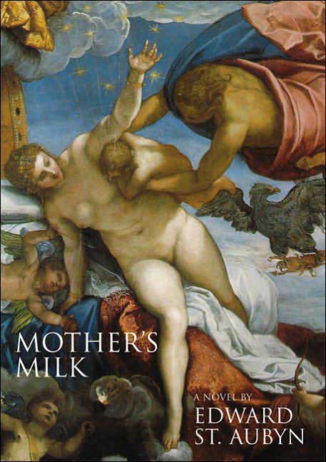 Mother's Milk
by Edward St. Aubyn
This book has “also-ran” written all over it. The cover is a detail from what I presume is a classical painting in the style of Michelangelo. Angels and otherworldly creatures abound, but the focal point of the piece is a robed figure holding an infant out to suckle at the breast of a naked woman. Yawn. Sorry. It just looks a lot like the cover of my first-year Classics textbook.
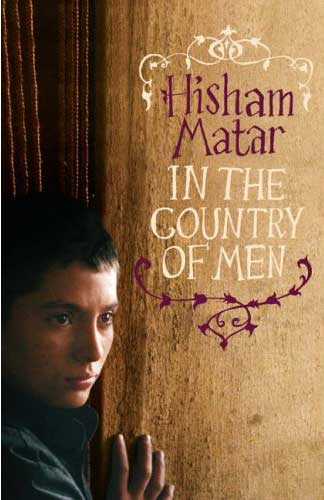 In the Country of Men
by Hisham Matar
Now here’s where I have to confess that in the past few years, the publishing industry has conditioned me to believe that any time I see a photograph of a besmudged Middle Eastern child on the cover of a book, especially if said child is looking very serious, the story is going to be a wartime tale. I could be wrong about that, but you can bet your bottom dollar that this book is not light comic fare.
And yet! That font the publisher has chosen for the title… as well as that nifty little scroll design… both are so airy… so whimsical. I am baffled. Now, the question is, will the Booker judges by put off by this minor bit of cognitive dissonance? I think they might. No one minds being wrong about their assumptions of a book, but everyone minds not being able to get an initial bead on the book. Better luck next year.
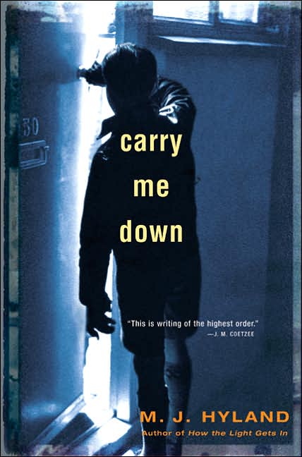 Carry Me Down
by M.J. Hyland
This one is a bit of a cheat. The publisher has sneakily placed a blurb by two-time Booker winner J.M. Coetzee on the cover, stating that “This is writing of the highest order.” The publisher also makes a point of reminding us sternly that Coetzee himself is not just a past Booker winner, but also a Nobel Laureate. Who are we, the humble reading public, to contradict the authority of a publisher’s blurb?
But let’s move on to the cover photograph. We see a young boy from behind, as he peeps out of a doorway. He’s in a somewhat dingy room, so we can guess that he comes from working-class roots, something the prize giver-outers always love. He’s wearing short pants and thick knee socks, which indicate this is a period story of some sort, also a crowd pleaser. The room he’s in is dark, but we see light coming through the slightly open door. He’s peeping out from darkness to light, so we can guess that he’s seeing something wonderful or awful. Either way, it’s something that has changed or will change his life forever. And it goes without saying that this is no ordinary boy. They never are.
I’m thinking this story could be a winner, but for the fact that it’s vying with this next title, this year’s Booker winner.
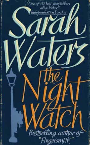 The Night Watch
by Sarah Waters
Sarah Waters… Sarah Waters… Sarah Waters. Can I have a word with your publishers, please? I’d like to ask them why they persist in making your books look like the cheesy novels that they so brilliantly riff on. Your most recent book, The Night Watch, looks like a cheap dime-store thriller. A lamp post? A LAMP POST? And yet you write so beautifully, you’re such a captivating storyteller, and you do such a subtle, clever, haunting job of reinventing other genres. Not only am I sure that The Night Watch is an incredible story, I’m equally sure that the Booker committee will forgive this aesthetic lapse as readily as I do. Congratulations.
***
So there you have it: a rigorous analysis of this year’s Booker contenders. The winner: The Night Watch by Sarah Waters in the final heat. The Booker committee will make its official announcement on Tuesday, October 10th. Tune in then, if you must.
10 comments:
Oh, I really liked this post, I'm glad I could take a look at these books here on your site at least. Unfortunately they only have the first one, with the oh-so-predictable cover art in my library, so I'll try reading that by the time they announce the winners. At least I'll have one covered.
And I don't mean to be nozy, but the nobel laureate person's name is Coetzee. I only know cause I read his novel 'Disgrace' this summer in one day, and liked it a lot. Funny name, that is. :)
Doh! I have no excuse. I feel shame.
But I'm glad you're inspired to read some of the titles. I'm thinking of hitting The Night Watch first, then Hyland's novel. Since I wrote this piece, I've read actual descriptions of the books, and none of the rest particularly float my boat.
While I consistently use the Cover Art Approach to determining what to read, applying it to literary prizes is something I never thought of. Yet, why not? Makes sense. Ever thought of putting together a coffee table book with winning cover art...?
The Night Watch is the only title that I've heard of on the list, and I've actually read it. I loved Sara Waters' other books, but this one just didn't gel together for me in the same way. I was unable to put her other books down, but The Night Watch is set later in time (WWII) and somehow this period wasn't as captivating to me.
genius, sheer genius
i think that this approach should be reversed and applied to such fine art judging as the turner prize. I did read nightwatch, and found it a little less fantastic than tipping the velvet and fingersmith - longer on war time trauma and cerebral over analysis and lighter on the gothic explorations of obsession and passion which she does so much better than Jeannette Winterson and Joanne Harris
I have to wonder what your thoughts would be on a paperback of Les Fleurs du Mal which I picked in Dijon about twelve years ago. It features -- I am NOT making this up -- a mermaid giving head to an angel (I think. He had great big white wings, so...), surrounding by the crashing surf on the beach. I really wonder how many people began reading Baudelaire just because of this.
DNTO has a podcast which can be found here and here is a direct link to the mp3 - your segment starts at about the 22min. mark.
Great stuff.
I just caught this on the DNTO podcast. Very nicely done. I have a copy of Sarah Waters that I received as a present from an editor I know. They didn't even review it for the paper. You're right, the cover is unimpressive.
I'm in the midst of choosing my own cover right now, for a book to be published in 2007 (ECW Press). It's truly difficult to choose a cover, to know that this is what will make the readers either pick up the book in interest, or ignore it completely.
Check out my blog - shelf-monkey.blogspot.com. It's covering the trials and tribs of the whole process (at least, when I remember to update it). The book is called Shelf Monkey, and as the name implies (I hope), it is about bookworms. Manic depressive bookworms.
congrats. I have just ths minute logged into your blog to read the post I am listenning to right now on the best of DNTO podcast.
As for the books, you declaration makes me want to go out to find and read Sarah Waters book right now.
I havent read the book or any of the others yet. I'm sure some of them will find their way onto my reading list.
I just found your blog and boy, am I glad I did! Loved this post - do you think you might do one like this for the Giller shortlist or how about the GG's? Enjoyed this very much. I am going to have to bookmark you so that I can return often.
Post a Comment