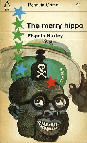
Rusty sent me this link to a rather nifty photoset on Flickr. Somebody's taken the time to collect some very, very cool cover art from old Penguin novels. Devotee that I am to Penguin's classic orange covers, I have to admit that these are pretty awesome -- quirky, evocative, and sometimes downright weird.
When I compare these covers to the cover art for some contemporary novels that I reviewed a while back, I have to wonder why book design has gotten so boring. Can anyone fill me in?
6 comments:
Yeeeah, design got boring when computers made it easy, cheap, and the next think to unskilled labour. Why pay an artist to draw a cover when you can get an intern to slap together some text on a stock photo?
It still sucks, though.
Yay DoppelSis!! And Yay DG too...
Now was that so hard?
I agree that computers have taken away away work from true artists. I appreciate art that is created rather than programmed. The same is true for movies. Back in the day movie makers had to be creative in making their special effects. Take Alfred Hitchcock who used chocolate syrup for blood. These kind of things make a movie more interesting. Nowadays it's all a push of a few buttons and there's your movie. It may look more real, but I find it disappointing knowing that they have taken the less creative way out. Where have all the artists gone?
By the way I love The Matrix.
book design is boring now because after something is designed, it has to get approved by 9347546 other people who KNOW how easy it is to change something on the computer. they say "can't you make that blue instead?" "make the type BIGGER!" and "oh, just PHOTOSHOP it!" etc etc. I know because I work in the design department at a major book publisher. yeesh. it's frustrating to look at old designs and wonder why I can't be that creative...
I think -generally- covers for the US are more obvious than for the UK. A lot of US covers, expecially for genre books, are designed to show exactly what's in the book. If Ms A is a radio presenter, you'll see a mircophone, if Mr B has an epilstolery affair, you'll see a letter with SWALK on the back.
UK covers are probably more about a) being attractive and b, which might be more important given the whole british thing) not being embarassed to be seen reading it, like you would if it looked boring or cheap. It should look interesting, otherwise the random strangers on the bus will think less of you.
I did think several of those old book covers were interesting, but I think there are some really tantalizing covers today, too.
Post a Comment